Portuguesa typeface
Portuguesa is my first type design project in collaboration with Ale Paul for Sudtipos.
Calm streets, quiet afternoons and a mix between tradition and modern life.
It is there where Portuguesa sets down.
Inspired by the graphic spirit of old packaging and store signs of Portugal, this font seeks to transmit the warm and sunny sound of Portuguese language in a visual way.
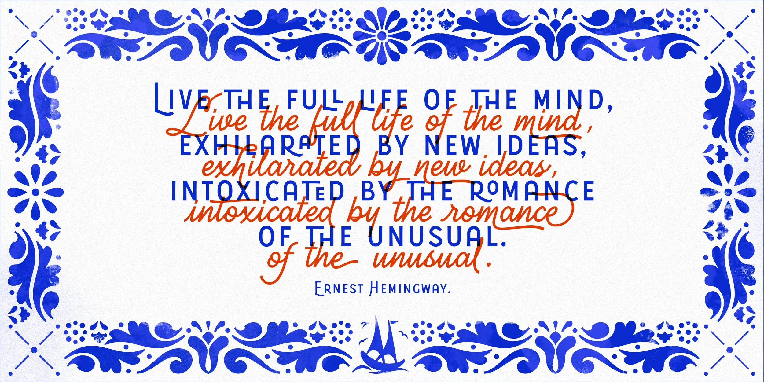
Portuguesa has 3 partners, designed to work nicely together and to complement one with each other.
Portuguesa Script, with friendly and rhythmic personality, great for titles and short text, Portuguesa Caps, with small caps and ligatures that perfectly match (and contrast) with the script version and Portuguesa Icons, that recalls the legendary blue tiles. This last version was specially designed to mix signs up with delightful combinations for creating patterns, borders, stationary, tableware and all kind of commercial products and projects that needs a memorable strike.
The possibilities are numberless.
As a mantra, Portuguesa is always in a positive mood, spreading the “Portuguese art of welcoming people”.
Seja Bem-Vindo!


Portuguesa is available here
〰️
Portuguesa is available here 〰️